 English


Bento Grid Layouts: The Modern Web Design Trend You Need to Know

Imagine opening a website and not finding anything in place. The content is scattered, the pictures are not in order, and the website structure is distorted. Would you like to view the website further?
On the other hand, there is a well-presented, clean website structure. When you open the website, you instantly find what you are looking for. The content is well presented; the key information is highlighted, and there are smaller boxes that help you navigate further.
Which website would you like to surf? The answer seems very clear. The strategy behind a well-structured website is a bento grid layout.
So, let’s take a closer look at bento grid layouts, why they matter, why designers love them, and how you can implement them to keep your website modern without sacrificing usability.
What is a Bento Grid Layout?
It is a layout pattern that helps structure and organize website content to retain visitors. The concept of the bento grid layout is derived from a Japanese bento box that has separate sections to hold multiple items.
So, in one bento box, there will be space for the rice, side dish, and dessert, all separated neatly! It makes the lunch look neat and presentable (and easy to eat). Similarly, Bento grid layout benefits websites by making them look visually appealing and balanced. Everything has its place, which helps with better navigation.
Why Are Bento Grids So Popular?
With the advancement in technology, several bento grid components work together to create a user-friendly website. Previously, most websites were clumsy and presented all the information in long blocks. But now, with the help of bento grids, content is divided into smaller fractions, which increases the visibility of the website and accelerates its proper functioning.
Where Do Bento Grid Layouts Work Best?
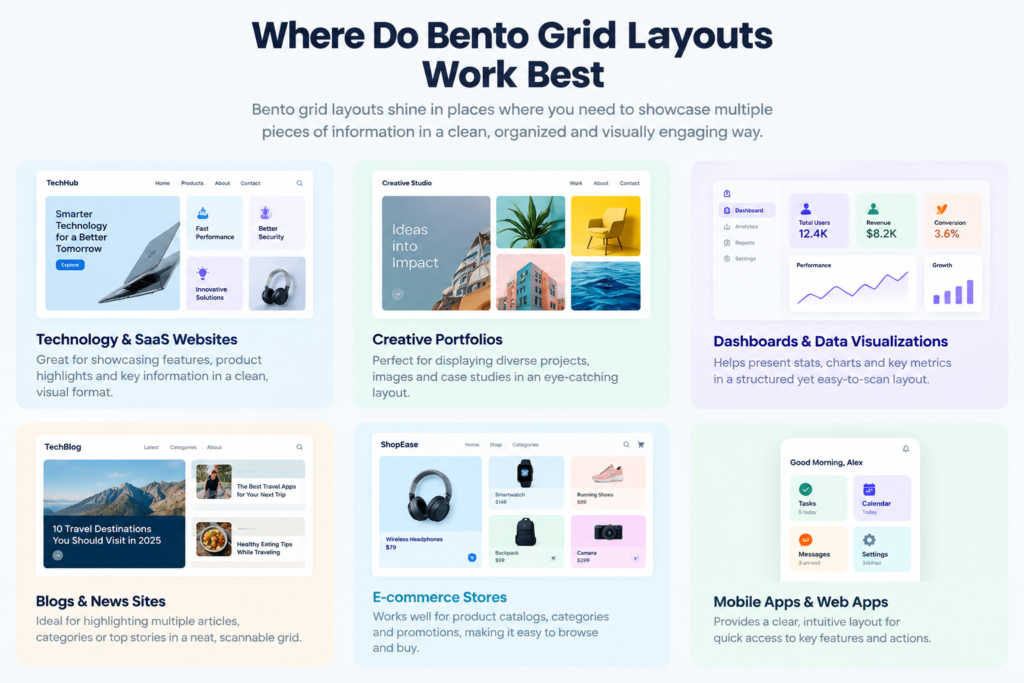
A bento grid layout works best when a cluster of information needs to be presented without overcrowding the website and making it clumsy.
- Product Pages: The bento grid layout allows a product to exhibit its features in a single scroll without overwhelming users. Most conventional websites cannot show ten features simultaneously. This can discourage the user from scrolling and exploring the website further.
- Portfolios: A Bento grid layout gives each project the right amount of space needed on a website. NNGroup states that website hierarchy needs to be prominent; otherwise, users wouldn’t know where to focus. It also makes the portfolio look more interesting, cutting through the monotony.
- SaaS websites: Bento grids are useful for showing different features of a software product. The visitor’s focus remains on key features, pricing benefits, integrations, or product screenshots. Unlike most websites, the Bento grid helps visitors understand what the software offers without reading large blocks of text.
- Dashboards: Bento grids make dashboards easier to understand by giving each piece of information its own card. Larger sections can highlight important messages, while smaller blocks can provide supporting details, such as charts, sales figures, or key statistics. This creates a clear visual hierarchy and helps users understand the most important information at a glance.
- Technology Websites: Bento grids are very useful for technological websites. These blocks represent numbers and data in an organized way, breaking them into small segments for easy understanding.
- Landing Pages: This grid helps in gaining a strong Call to Action by giving generous offers, benefits, and key information their own visual space. It can also turn a monotonous web page into a visually stunning layout. Each bento grid has a clear purpose, helping create a website that is engaging and easy to navigate.
Key Elements of an Effective Bento Grid
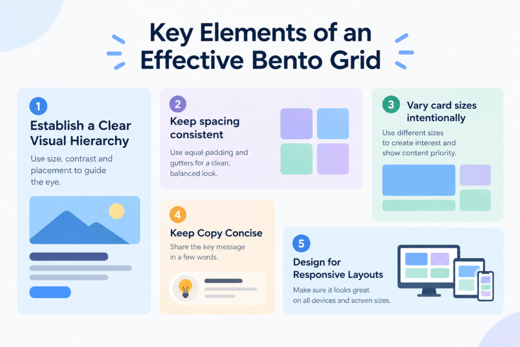
Certain elements help in making your website eye-catching and can turn visitors into customers. These are as follows:
- Establish a Clear Visual Hierarchy
A modern bento grid UI can make a website more engaging and user-friendly. An effective visual hierarchy can create a natural flow for readers without any sudden disruption. A natural flow can direct users through your website easily and effectively, increasing website popularity.
- Keep spacing consistent
Good spacing makes a bento grid look clean and organized. Keep similar gaps between cards so the layout does not feel messy. A clean and polished space helps in attracting leads. Make sure there is also enough space between the text, images, and other elements inside each card. - Vary card sizes intentionally
Larger cards highlight important, attention-grabbing portions, while the smaller ones focus on less important content. This way, the website’s structure is maintained, and people can easily identify what they’re looking for. - Keep Copy Concise
Do not overstuff the cards with too much content. Otherwise, the website will become dull and congested with unnecessary information. Viewers will find it boring and eventually leave the website. Keep the copy short and meaningful for better audience engagement.
- Design for Responsive Layouts
A bento grid should look good on desktops, tablets, and phones. According to Mozilla, it should have a flexible approach and should be able to adjust on any screen. Test the layout on different devices to make sure text remains readable and nothing feels crowded.
Make Your Websites Meaningful
Balance the use of large, medium, and small-sized blocks. The various sizes should provide visual interest for viewers, making sure they stay and interact with your website.
Conventional and Bento grids both organize website content, but they differ in how they present information. Here’s a quick comparison:
Bento Grid vs. Traditional Grid
| Feature | Bento Grid | Traditional Grid |
| Card size | Varied | Mostly equal |
| Style | Dynamic | Structured |
| Hierarchy | Strong | Simple |
| Flexibility | High | Moderate |
| Best for | Modern websites | Basic layouts |
How to Create a Bento Grid Layout
Creating a Bento Grid isn’t an enormous task. Here’s how to do it:
- Try having a fixed plan beforehand. Understand your content and use write-ups, images, data, tables, and charts accordingly.
- Evaluate the overall structure before placing it on the grid. Consider the rows and columns you need to input for better understanding. Sketch out the visuals before incorporating the final design.
- Pay attention to every minute detail. This will help with better formatting. Use consistent margins and plan the content placement for a cleaner look.
- Make sure the website is user-friendly and adjustable between various screen sizes. Coding experts at Penpot have highlighted the use of CSS Grid or Flexbox to create a responsive Bento Grid. Remember, generating your website correctly can help you gain momentum.
- Lastly, test your grid after execution is complete. Ensure credibility and usefulness before the final launch.
How to Make a Bento Grid Responsive and Accessible
An easy-to-navigate website always grabs the audience’s attention. When designing a bento grid, responsiveness is essential. WCAG 2.1’s Reflow criterion requires content to remain usable without two-dimensional scrolling at a 320 CSS-pixel width. Maintain the colour palette and use flexible cards that can resize or stack, keeping text large and readable. If cards are clickable, make sure they are keyboard-friendly, and avoid excessive animations that can distract or make the page difficult to use.
When Should You Avoid a Bento Grid?
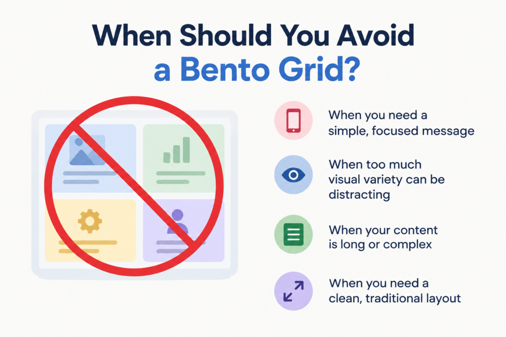
A bento grid should be avoided in long-form articles as it can disrupt the rhythm of the content flow. It is also not apt for legal content, as these websites require continuous reading. Bento grids are also less suitable for step-by-step processes or any content where readers need to follow information in a specific order. It should be avoided on highly linear processes and on content requiring sequential reading.
Final Takeaway
The Bento principle shows that Web design isn’t solely about being modern; it is about structuring information naturally to hook the audience. These blocks can be flexible and convert a dull web page into a more dynamic one when used hierarchically and responsively. If you are interested in website structure and how it works, feel free to share your tips at technology blog write for us.
FAQ
Define a bento grid layout
A bento grid layout is a collection of website content within different-sized blocks. Making it convenient for users to understand the content easily. It helps to develop a uniform and organized layout with a vibrant aesthetic.
Are bento grids good for mobile websites?
Yes. Responsive design makes bento grids adapt to smaller screens. Although they are adaptable to mobile screens, responsive layouts can still have layout shifts or awkward transitions if poorly implemented.
Is a bento grid layout necessary for every website?
No. They are usually not ideal for long articles, legal content, etc. Although bento grids are suitable in most cases, it needs to be avoided for websites that need to be read in a specific order.